South Frontenac Brand
A brand is more than just a logo. A brand is what people think and feel when they hear the name South Frontenac and can be based on personal experiences, word of mouth, the ads and marketing materials people see, and messages we share.
South Frontenac brand guidelines
Our brand story
South Frontenac is more than a place – it’s a breath of fresh air, where you can enjoy a well-rounded and relaxed lifestyle. It’s an opportunity to live rural, surrounded by scenic lakes, trails and wide open spaces, while still being part of a thriving and bustling community. It’s small towns with big opportunities, original offerings from artisans and business owners, and easy access to all the amenities you desire. South Frontenac is the rural living you crave without compromising on convenience or a sense of community.
The meaning behind our logo
Our logo reflects the heart of South Frontenac, its people and its elements.
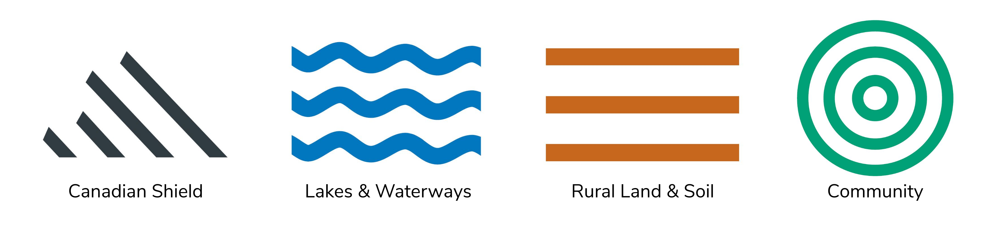
- The grey bars represent the Great Canadian Shield, protruding powerfully from the earth, symbolizing durability and strength
- The blue waves represent the crystal blue deep lakes and waterways that flow through our region
- The brown furrows represent the land and rich soils and our rich agricultural heritage
- The green circles represent the lush, green natural environment and world we live in
If you would like to use our logo or any of our brand assets in your publications or communications, you need to request permission. Please send logo requests to communications@southfrontenac.net.
Sign up to receive our monthly newsletter
Stay up to date on Township news, events and projects by subscribing to our monthly newsletter.